Showing posts with label Work Of Art.. Show all posts

Thursday, 21 April 2016

Card Evolution

I knew the colours and the theme for this morning's card weeks ago....well, I did make the challenge myself as I continue to host CAS Colours & Sketches for April, but even so it is Wednesday evening and my card is only just finished.


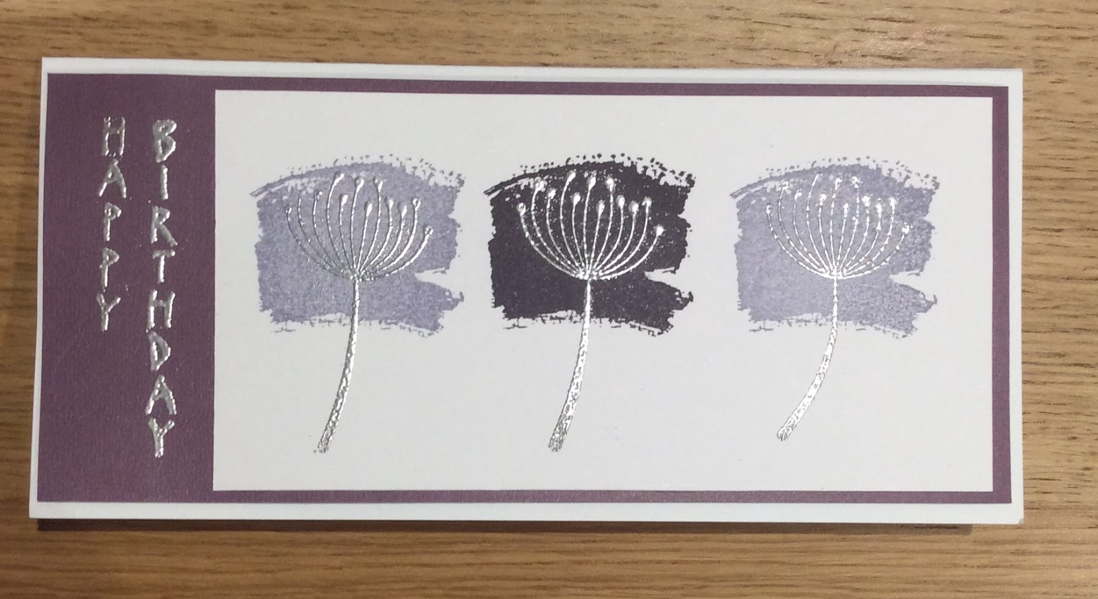
This is the one, the final version, a one layer card using Work of Art and a magazine freebie image.


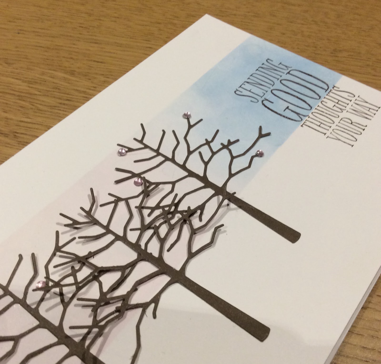
This was my original card and design. I wanted a bokeh effect on the pink and blue and die cut the cherry trees. It's not that I don't like it, it's just that it didn't quite come out as I'd hoped. I added a few tiny pale pink rhinestones, they improved it but didn't really feel as CAS as I wanted.


Two more attempts at the masked panel of blended inks and !%*#^ bokeh and I gave up.


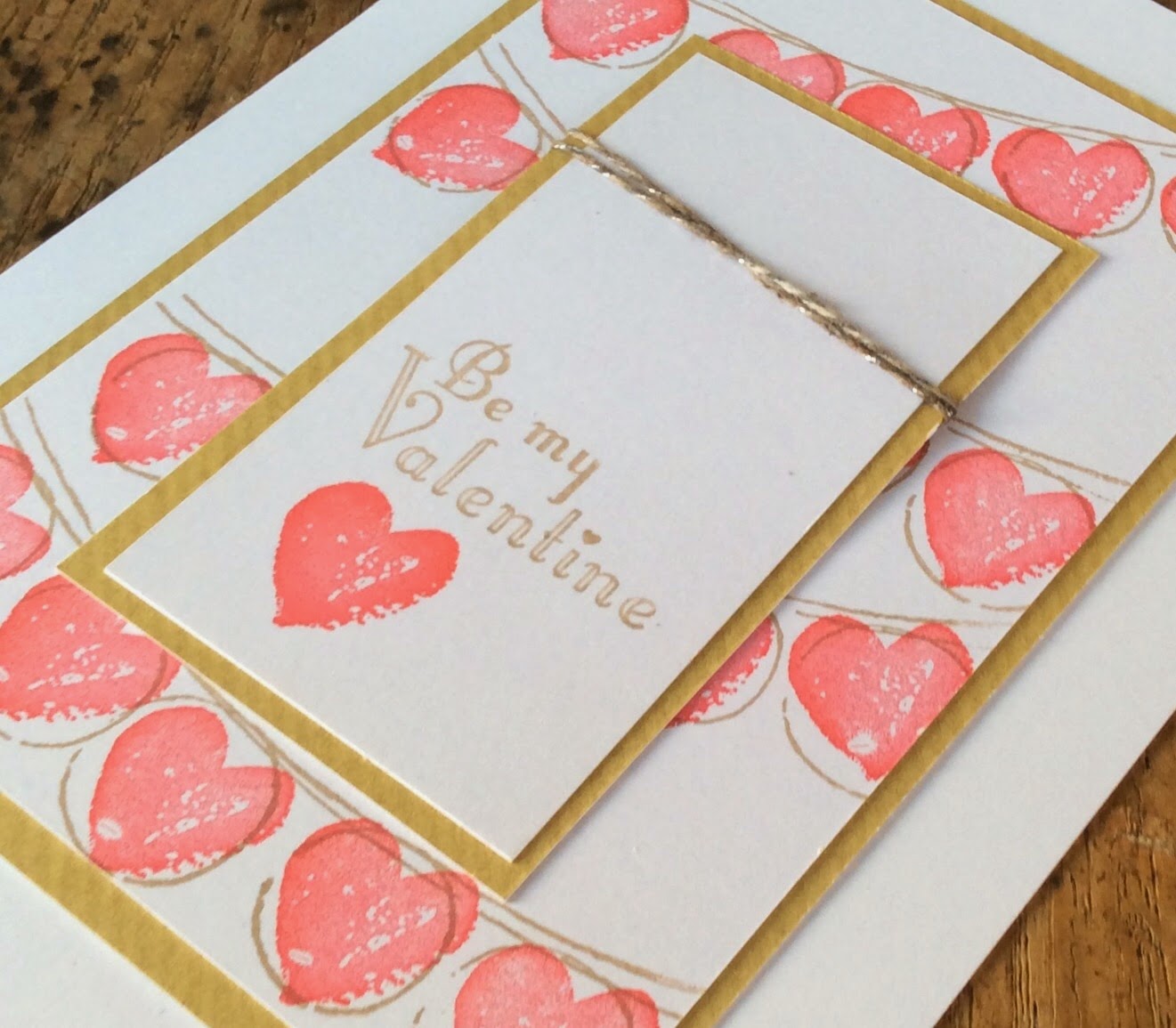
I wanted something arty so I turned to my favourite way of colouring, Work Of Art stamps. I loved this card until the final stamp, also a freebie. It just wasn't crisp enough for my liking, not for a DT card....


So here it is again, the final card. Hope you enjoyed the short story of its creation and manage to get your card for the challenge made with a little less frustration.


Thursday, 3 March 2016

Tulips from Amsterdam

Not really from Amsterdam, from Backyard Basics  but Spring is in the air, with spring flowers and lambs, as I look through my window and this card jumped out at me so quickly and I am rather taken with it. My starting point was the colour palette chosen by our new hostess at CAS Colours & Sketches, Jane.


I had to take a few liberties, as I have none of these colours! I used the three closest shades I could, Gumball Green, Rose Red and Pistachio Pudding. Actually, whilst I would never have put them together I really like this combination, especially for florals.

I really took my courage in both hands and made a one layer card and so would like to enter it for the challenge at CAS On Sunday
First I stamped the tulip out
One in the darker green, using my Stamp-A-Ma-Jig to get them lined up perfectly. 


Then I over stamped the flower heads, using a stamp from Work Of Art and the Rose Red. I used another stamp from the same set for the stems, bending it very slightly.
Nest I drew a border in a fine line black pen and stamped on most most modern birthday sentiment.


My biggest challenge on these types of card is keeping away the smudges...think I managed this time.


Thursday, 18 February 2016

A Study in Purple

Long and thin, no, I'm not talking about me, unfortunately, just my card for this week's challenge at CAS Colours & Sketches where we have a new colour challenge, chosen by Stef


This looks like an awesome combination, just up my street, as they say, me being a purple and silver fan. However, I have to admit that I don't get on withElegant Eggplant. On the case of the ink pad it's a gorgeous deep purple, but when I stamp it it always looks black. So, stamp it off, I hear you say! Then it looks grey.
I am hoping SU will bring out a better purple soon, but enough moaning, where's the card???


I used Work Of Art to create the three colour blocks and then had to wait before I could stamp the seed head in Versamark to heat emboss in silver.


The vertical greeting was in the freebie magazine set I used to make my oriental themed card a couple of weeks ago. It's the only one I have, although I always look out for more. I used elegant eggplant card stock for the mat.


Thursday, 10 September 2015

Grungy Flowers

I'm back! This is my first post since I went off on holiday, the five of us (hubby and three offspring- can't really say children anymore!) were lucky enough to be able to get away for a three week whirlwind tour of Florida, finishing with some theme park fun days out in Orlando. It was a ball! Now I've had a good break I really enjoyed an afternoon of crafting earlier this week when everyone went back to school, work, university etc. I made three cards but I've just got one to share this morning, it's for the sketch challenge at CAS Colours & Sketches

I had a little extra help too, from the colour palette at The Colour Throwdown


I used a stamp set from Visible Image for this one. If you know me you'll know I don't do floral very often or very well, so this stamp set caught my eye as a bit grungy and alternative. See what you think...


A purist might say that a CAS card is no place for embellishments and, on the whole I agree, but these little brads from Stampin Up just matched so perfectly and I thought they added something to the card, rather than detract from it. I just love the little Kraft coloured butterfly! There is plenty of white space too 

I also used Work Of Art to stamp the 'buds' beneath the brads. The sentiment is from Blooming Marvellous and I used my Stamp-A-Ma-Jig to get it in just the right position. 


I used Kraft card as a mat and added a simple scored frame. I hope that, like me, you find some time to craft in this coming week and I look forward to seeing those sketch inspired cards over at the challenge blog.


Wednesday, 5 August 2015

Life's a Beach

Just back from a week's holiday in Morroco with my lovely husband, rest and relaxation was the order of the day. We were staying right on the coast at Essouria and so I have watched some gorgeous sunsets, the inspiration for my card today for the new challenge at The Male Room.


I used Wetlands and Work of Art for this one and created a sunset


I love both of these stamp sets so much, Work Of Art is just so versatile and Wetlands is perfect for masculine cards. If you look closely you will see that I've added some guilding flakes to the sun's reflection on the sea.


I haven't added a sentiment yet, I think this card could be used for a variety of occasions so I will add the sentiment inside later.
Looking forward to my next holiday now, which will also feature the beach as we are off, as a family this time, to discover the coastline of Florida. Of course, the kids have also insisted on some time in Orlando to visit some of the theme parks!


Thursday, 18 June 2015

For My Dad

Hello! This morning I have a very clean and simple Fathers' Day card, which I have made for my Dad. I used the colours from this week's challenge at CAS Colours & Sketches


If, like me, you don't have these colours just use something close - I used a Matt silver, More Mustard and a generic green to stamp on my card. I also used two of my 'go to' stamp sets, Wetlands and Work Of Art. Do you have favourite stamp sets too? Ones which you love to use over and over again? I've teamed them up with the Hello You thinlets die and Best Ever Dad, to make the sentiment.


I used the sketch from CAS(E) This Sketch


I used the silver and the green stamped and then stamped off to create the four panels. Then I stamped the goose in More Mustard, carefully positioning the image with my Stamp-A-Ma-Jig so that the plumage of the bird would match up.


Finally I added the Happy, cut out of green card stock and stamped part of a sentiment in the silver. 

Thursday, 9 April 2015

Flowers in Art

Today I have a card to share with you based on a sketch which I chose for CAS Colours & Sketches, ...actually I have two cards. This is the sketch, kind of a classic layout for a clean and simple style

For the first card I used Simply Sketched stamp set, along with Work Of Art and Gorgeous Grunge. This is the one I made for CAS colours & Sketches. It didn't start off as a sympathy card, but the black border just kind of made me think that it would make a good one, although I hope I don't need one anytime soon. I moved the sentiment off centre and used Rose Red and Mossy Meadow inks, both stamped off twice before stamping over the image, using my Stamp-A-Ma-Jig to get the position of the colour just right.


I then saw the colour palette from Cupcake Inspirations and decided that with a little tweak of a cream coloured card base I could make a similar card for the challenge over there.


This time I used Best Of Flowers for the hydranger bloom and the sentiment from Work Of Art as it seemed to fit better. To keep in with the art theme I only used the watercolour swoosh from the same set to colour my image.


This time the stamping off gets lighter across the panel, I like that graded effect, and I used a raspberry colour mat for the flower panel.

Both cards are tent fold


Wednesday, 25 February 2015

Its Your Day

Good morning crafters. I am off to indulge in one of my other craft hobbies this morning, beading. To be more accurate I'm off shopping for beads and calling in to see my daughter, who is away at University, so a top day for me. Just have time to quickly post my card for CAS Colours & Sketches and today we have a sketch challenge for you.


I used my stamps to create the panel, from Work Of Art, just love these stamps


I had a little help with the colour scheme fromThe ColourQ team
and I want to thank the team there for choosing my Valentines card as a Colour Q Courtier, I was really chuffed.


I used a very simple silhouette stamp from an old, long-retired set, added a punched butterfly in matching cardstock and a banner from Decorate A Daisy.


I love the clean, crisp white space, enhance by popping up the whole card front on foam tape. I've noticed how other crafters have done this, rather than matting onto coloured cardstock and I think it gives a great CAS feel to a card.

Wednesday, 4 February 2015

Valentine Celebration

Valentines' cards, love 'em, but I don't make them very often and I'm not a big fan of lovey-dovey stuff, so my cards are often quite masculine in feel, which is a good thing because today my card is for The Male Room. Valentine is the theme over there for the new challenge which lasts for two weeks, well past the day for lovers.
This time I used a sketch from Cas(e) This Sketch as my starting point. I have often seen links to this challenge blog but never ventured over there before...boy was I missing something! I loved all the cards I found there, CAS- my favourite style, all beautiful, from the DT and challenge entries so I thought I'd join in. Here is the sketch


I used three stamp sets here, Happy Celebrations, Delightful Dozen and Work of Art, combining them to make strings of heart shaped lanterns. The central panel is kept very clean, one more heart with the sentiment and the twine, coloured with ink to match strung across at just the right spot.


I kept the colour scheme simple too; white, red and Crumb cake/kraft.


  Keeping the stamping crisp was the biggest challenge, although getting the excess ink off the string also kept me busy for a while (I'm too impatient to just leave it to dry and come back later!)

Thursday, 13 November 2014

My Heart is a Work of Art

It's a quick, clean and simple card from me this morning for this weeks sketch challenge at CAS Colours and Sketches. The sketch was chosen for us by Lizy and I made a very conscious decision to keep away from Christmas cards, although you could make beautiful Festive cards with this sketch?


Here is my card, I've used washi tape for the two main panels and the heart is from the Work of Art stamp set. I used some white raffia  to make the bow. The YOU is part of a stamp which says Thank
You from the set a Fabulous a Four. Very quickly made, ready for someone special.


Thursday, 7 August 2014

Hearts and Stripes

It's August, and I will be taking my annual trip to the USA soon. I was reminded of this when I saw the colours for this week's challenge at CAS Colours and Sketches

I had in mind to do a Stars and Stripes card, as I've pinned a few lately, but it just didn't happen. This did..

Although I have stuck to the two colours, I have stamped off to create lighter shades. The Work Of Art stamp set is going to be my new BFF, I think. I cut out the hearts and have popped them up on foam pads at different heights. The DP I've used had cream hearts and so I coloured those in with my marker pen to keep with the colour palette. Not added a sentiment yet, as I'm not quite sure what occasion I will use it for.

Sunday, 27 July 2014

Geometric Work Of Art

Phew! I finally made it, with a bit of help from the internet and a colour challenge. What am I talking about? My DT card for The Male Room of course! A couple of days ago we posted a new challenge, geometric cards for men/boys and do you think I could get an idea going...useless. Today I was searching for some inspiration and a I came upon a card here that I instantly liked. A quick search for a great colour combination and I found The Colour Throwdown Challenge this week had three gorgeous colours and a photo inspiration of Venice and my mojo kicked in.


I associate Venice with art and I have my new Work of Art stamp set to play with. Can I make a geometric card with what is essentially a collection of watercolour brushstrokes? Well, I'll let you be the judge of that.


I hand cut the frame, stamped the modern art, added a sheet of acetate over the top, popped it up on foam pads, and used Off The Grid to set it all off. I punched out a few circles stamped from the Work of Art set too.