Thursday 30 April 2015

Tumbling Wallflowers

Quick post from me today to share with you my double challenge card for CAS Colours & Sketches. A double challenge means that we give you the sketch AND the colours to use. It always amazes me how many different cards we see in the gallery on these weeks, given that the style, colour and layout must be the same.

I saw a card in one of the challenges which had been stamped before embossing, and I thought I would give that a go. I used a stamp set called Blooming Marvelous and a brick wall background embossing folder.

After embossing I added a few more fussy cut blooms and a sentiment from the same set.. I mattered onto more white card before popping the panel up on foam pads.


In the photo below you can see the layers better.


I was hoping to create the look of flowers tumbling down a wall and got my inspiration from a photo I found on the Internet. These flowers create a splash of colour on an otherwise bare wall. 


Wednesday 29 April 2015

Night Owl

Being away at Uni, my daughter sometimes asks me for cards for her friends. This one is for a guy, clearly, since I have made it for the new challenge at The Male Room.

 them 

I have a new blender tool which is totally awesome and so I couldn't resist doing a silhouette card. The Owl Builder punch and the Bird punch are both used here. 


I made the sentiment using my computer, I think it will be quite apt for a student!


This last photo shows the owl is popped up on foam pads


Saturday 25 April 2015

Triple Time with three stamp sets

It's Saturday again, that's a nice feeling! I've had such a busy week, I've been away from home for work, for the first time I think since having my children! I've really enjoyed a few nights in a lovely hotel, with colleagues, learning new and very useful skills, but I'm afraid it's put my crafting on the back burner. Just had time last evening to make my last hostess card for April for 52 {Christmas} Card Throwdown and, like many things when you are rushing, it took me a few goes to get it right. I've chosen to finish with a technique


This is definitely a technique I love to do. I have used heat embossing this time, and combined three stamp sets, definitely not all Christmas ones! I have kept to a two colour palette: Blackberry Bliss and Mossy Meadow


I have used the sunburst from Kinda Eclectic, and images from  Ornamental Pine and a touch of Gorgeous Grunge. There are a few gems dotted around and I've popped the ornament up on foam pads. I used more Blackberry Bliss card stock for the mats. I have offset the three layers, you can do so many layouts


It had to be quick, I was so tired after the training course, hope it doesn't show in my card!

Thursday 23 April 2015

Chalkboard Mosaic

Good Morning! Today I want to share with you a card which I created based on a sketch which I designed for today's new challenge at CAS colours & Sketches, so it's kind of all my own work! I do like to be a bit different and I decided that there were not many cards around which use triangular layouts so I came up with the one below

 
I wanted to use Mosaic Madness stamps and I combined them with a sentiment from Big Day done use the chalkboard technique. I played around with the mosaics, mixing colours and designs but finally settled for blocks of colour with the same repeating pattern.


I hope that you don't think that the chalkboard is not really CAS, I think it is since the design is uncluttered and has lots of 'white space' which, in this case, is black! I kept the whole card front quite flat this time.


 I did, however use a Kraft coloured mat beneath my chalkboard and popped that up on foam pads to enhance the chalkboard idea.

I really enjoyed making this card. It is quite different from others I have made and I think you could use it for male or female recipients. 

Saturday 18 April 2015

Sam's Christmas Card

I am well into my hosting month at 52 {Christmas} Card Throwdown and this Saturday it is a theme challenge. This is Sam, our much loved rescue cat, who joined our family five years ago as a very mature, streetwise gentleman looking for some loving care in his old age.


So he was my inspiration for today's challenge..


I have had this stamp forever and it only took a few moments to colour it ginger, using my Promarkers. I stamped the tree first, from Lovely As A Tree and added some sparkly bits with three colours of stickles


Once dry, I added my fussy cut cat and created the sentiment using you Little Furball and Ornamental Pine


Last Christmas I even found Sam his own pair of antlers


..doesn't he look happy!!


Thursday 16 April 2015

CAS Modern Art card

My second colour choice for CAS Colours & Sketches is a yummy threesome of purple, turquoise and red or if you like


I like using Off The Grid for feminine cards and it was my base for starting this card. I've bought a blender tool...don't know how I ever managed without one! It gives such an even finish, I love the effect of brayering but I still haven't mastered the technique and end up with sharp edges, the blender worked fine and gave a deeper more even finish than the brushes I usually use. Anyway, I blended the three colours onto white card and stamped over, using an image from Best Of Flowers. I offset the panels and assed three gems.


Two of the panels are popped up on foam pads and I added a sentiment from another stamp set. The card reminds me of art in a modern art gallery, although I would never call my work 'art'!


It's another tent fold card, that's just the kind of mood I've been in lately


Wednesday 15 April 2015

Faux Leather card

Do you like making cards for guys? Do you, as I do, live in a household of mostly males? If so, I hope you've checked out The Male Room and today over there we have two new members on the DT and a revamped look with some new graphics so it's definitely worth taking a look. The challenge runs fortnightly and this time it's


My card this week started out as a technique workshop at my local craft club to make faux leather. Starting with a piece of Kraft card cut to size, I sprayed it liberally with a solution of glycerine and water and worked it into the card without breaking down the fibres. It soon becomes pliable and you can scrunch it up and flatten it out again. You then emboss it, I chose the clock background, and leave it to dry (on a radiator this doesn't take too long at all). I then rubbed distress ink over the surface, which highlights the embossed areas. Finally it got a coating of spray and shine.


I have used Blackberry Bliss as the accent colour on the Kraft, adding a die cut sentiment, to which I tied a small tag, stamped with another clock face. I used coordinating bakers twine to do this. Here is a flatter view. I kept with the Kraft for the card base.


Do have a look at the other cards from the DT.

Saturday 11 April 2015

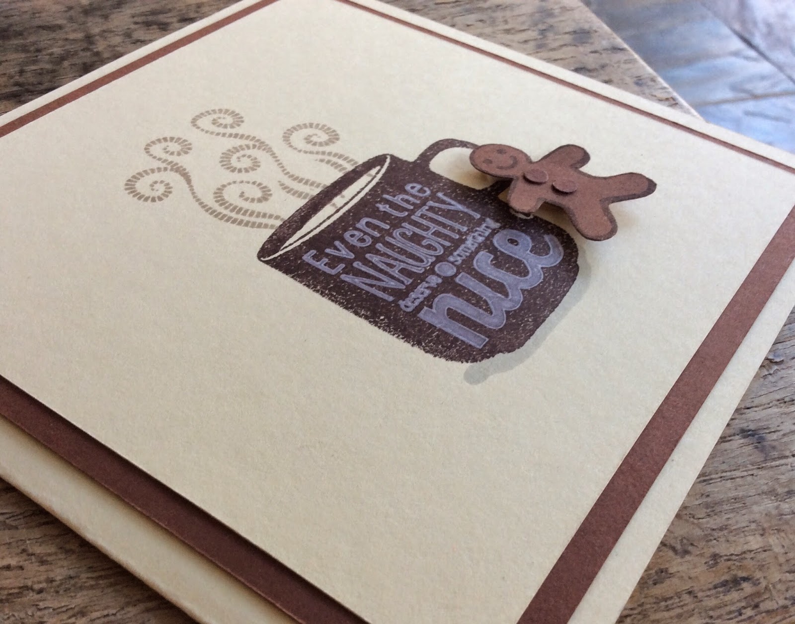
Coffee and Cream Christmas Card

Over at 52 {Christmas} Card Throw down you may remember that I'm hosting for the month of Awpril and for the colour challenge I have been a bit self indulgent! I have been trying to lose weight ove the last year and my only guilty pleasure has been coffee, skinny cappuccino to be exact, a treat every Saturday morning with my hubby after we've done the shopping. So I chose coffee and cream


Which actually turned out quite hard for me to make a Christmas card with! Sticking with the coffee idea and some inspiration from a card in last week's gallery this is what I have made


The stamps are all magazine freebies and the cream is just the base card stock. You can see I've popped up the little gingerbread man, and given him some buttons, curtesy of the cupcake builder punch.

Luckily, my DT team mates were not so short of inspiration and they have come up,with some fab cards for you to look at if you need some too. You can always ponder your design over a delicious cup of coffee!

Thursday 9 April 2015

Flowers in Art

Today I have a card to share with you based on a sketch which I chose for CAS Colours & Sketches, ...actually I have two cards. This is the sketch, kind of a classic layout for a clean and simple style

For the first card I used Simply Sketched stamp set, along with Work Of Art and Gorgeous Grunge. This is the one I made for CAS colours & Sketches. It didn't start off as a sympathy card, but the black border just kind of made me think that it would make a good one, although I hope I don't need one anytime soon. I moved the sentiment off centre and used Rose Red and Mossy Meadow inks, both stamped off twice before stamping over the image, using my Stamp-A-Ma-Jig to get the position of the colour just right.


I then saw the colour palette from Cupcake Inspirations and decided that with a little tweak of a cream coloured card base I could make a similar card for the challenge over there.


This time I used Best Of Flowers for the hydranger bloom and the sentiment from Work Of Art as it seemed to fit better. To keep in with the art theme I only used the watercolour swoosh from the same set to colour my image.


This time the stamping off gets lighter across the panel, I like that graded effect, and I used a raspberry colour mat for the flower panel.

Both cards are tent fold


Saturday 4 April 2015

Scrap Paper Card

As I mentioned on Thursday I am hosting a couple of challenges for which I am on the DT and this card is for 52 {Christmas} Card Throwdown. A few posts ago I had a lot of fun using up some scraps of paper on a card in a paper blocking technique so I decided to see if I could design a sketch to reflect that style and, with a little help from my much more computer savvy DT friends this is what I came up with


I used some scraps from a set of Christmas papers, so ensuring they all matched was not a problem. Kraft, white and red is a favourite colour combo for me. The arrangement of the papers is perhaps the most time consuming part of making this card. Once you have done that it's up to you what embellishments or sentiment you wish to add. I chose red twine and a small glittery bird


You can see the dimension I achieved by using a square of white card stock popped up on foam pads on which to mat the paper shapes. The twine and bird add texture too.


Friday 3 April 2015

Graffiti Stamping

At last! My card for The Male Room is done! I am not sure why it took me so long, but I had one of those eureka moments when I saw the sketch at  CASeThis Sketch this morning. Here it is


I was reminded of graffiti on a wall or fence and so set to work to recreate this idea. Now, I'm no Banksy and so I chose some stamps to be my slogans. Of course my background is the Hardwood stamp and I've used a Kraft card base. I used Rose Red, Mossy Meadow and Chocolate Chip inks.


You can see I used a blue mat layer, which helps the colours pop I think.
The challenge at The Male a room is to use metallic embossing and I've done this by stamping one of my 'slogans' in Versamark and then using copper embossing powder. I added a few bits of grunge too. Then I made a second card using Kraft to stamp on. I've left this one without grunge and this time I have left out the mat and used Kraft as my stamping base as well as for the card blank.


Thursday 2 April 2015

50 shades of Green (well, four anyway!)

April is going to be a bit of a busy month for me in blogland, as I'm hosting two challenge blogs where I am on the DT. The first one starts today. Of course it's the turn of CAScoloursandsketches on Thursdays and I've chosen this monochromatic colour palette


Green is so spring like, and I knew I wanted to use Kinda Eclectic again, so this became a lesson (to myself of course) on how CAS can I make it. I started by using my three shades of green, Certain Celery, Lucky Limeade and a Mossy Meadow and covering a sheet of A4 with the stamp images. Then I cut it up to use as a background.


These two above are the final, most CAS versions. On the way I first made this birthday card, using a Pear Pizazz marker for the sentiment and fussy cutting out a butterfly from Papillon potpourris.
This one I'm going to enter in the Anything Goes challenge at Seize The Birthday
I was lucky enough to be picked as a runner up last week so I'm going to support them again this 
week, well, it would be rude not to!


Then I made a card with more white space and used the sentiment from KE. I figured that I could reverse the white space, using it as the focal panel rather than in the background, but it was hard covering up all that lovely  green stamping!


So, which one do you think is most clean and simple in its design? I do hope that you like green and that you will be tempted to play around with your green inks, markers and papers in much the same way as I was. My sheet of A4 did actually make 4 cards, but I'm saving that last one to show you another day.