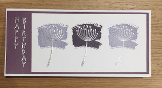
This looks like an awesome combination, just up my street, as they say, me being a purple and silver fan. However, I have to admit that I don't get on withElegant Eggplant. On the case of the ink pad it's a gorgeous deep purple, but when I stamp it it always looks black. So, stamp it off, I hear you say! Then it looks grey.
I am hoping SU will bring out a better purple soon, but enough moaning, where's the card???
I used Work Of Art to create the three colour blocks and then had to wait before I could stamp the seed head in Versamark to heat emboss in silver.
The vertical greeting was in the freebie magazine set I used to make my oriental themed card a couple of weeks ago. It's the only one I have, although I always look out for more. I used elegant eggplant card stock for the mat.


Fabulous line of seed heads, simple and stylish. I agree about the elegant eggplant ink looking black too.
ReplyDeleteI'm guessing you have a problem with blackberry bliss too then. It looks black if you don't stamp off. I have the same issue with wisteria wonder - looks great, but when I stamp it, it looks grey. Ugh. But - regarding your card...the seed heads in silver look awesome on the colour blocks and it's so much fun to have a different shaped card. Liz x
ReplyDeleteThe embossing really makes those delicate seed heads and the sentiment pop against the blocks of color. I have to agree with you, Jane, and Liz about the ink colors - which is why I chose to use cardstock for my card and avoid the purple inks altogether, LOL! ;)
ReplyDeleteLove the idea of the colour blocks behind the seed head. And who doesn't love metallic heat embossing - gorgeous! Caro x
ReplyDelete