Showing posts with label colour challenge. Show all posts

Thursday, 2 June 2016

Blooming Summer

As it is school holiday here in the UK I had time to sit and craft this morning to bring you my card for the new colour challenge at CAS Colours and Sketches, a rare luxury these days. I also went to a new catalogue launch for Stampin Up yesterday evening and can't wait to get my hands on some of the new colours and stamp sets, so I've been having a crafty few days, which all started on Tuesday with a trip to my regular craft club. We were using acrylic blocks to produce water colour effects and so I have incorporated that into today's card.


Can you see the colours? Aren't they lovely and summery?


I used an old set, I think it was saleABration, and I think it's called Bloomin' Marvellous to stamp the flower and the bird (can you see his iridescent eye?)The sentiment is, of course, from Happiest Birthday wishes. I have ordered some new sentiment stamps...hurray you say!
Finally, I decorated the inside of the card, unusual for me, with some DP and then cut a white mat to allow a message to be written and finished with another tiny bird stamp.


Thursday, 7 April 2016

Tangerine, Melon and Daffodils

It is my turn to host the challenges at CAS Colours & Sketches and I enjoyed choosing colours and designing sketches with Spring in mind. My first week was inspired by the flowers in the garden, lots of yellows and oranges, with the daffodils, and pinks from the primulas and tulips, the hardest part was only being able to choose 3!


When it came to making my card no green was a challenge, but in order to be chosen for top picks only the three colours maybe used.

I used the acetate block print technique to add the colours and then stamped the image, from Simply Sketched,  in the matching ink


It needed a long, narrow card base for this design to look its best. I added the birthday sentiment from the same stamp set and a Melon Mambo mat to add a pop of colour.


Love the arty look of this card, which still manages to hold onto a CAS style with the lack of 
 Embellishments and the use of white space.


Thursday, 3 March 2016

Tulips from Amsterdam

Not really from Amsterdam, from Backyard Basics  but Spring is in the air, with spring flowers and lambs, as I look through my window and this card jumped out at me so quickly and I am rather taken with it. My starting point was the colour palette chosen by our new hostess at CAS Colours & Sketches, Jane.


I had to take a few liberties, as I have none of these colours! I used the three closest shades I could, Gumball Green, Rose Red and Pistachio Pudding. Actually, whilst I would never have put them together I really like this combination, especially for florals.

I really took my courage in both hands and made a one layer card and so would like to enter it for the challenge at CAS On Sunday
First I stamped the tulip out
One in the darker green, using my Stamp-A-Ma-Jig to get them lined up perfectly. 


Then I over stamped the flower heads, using a stamp from Work Of Art and the Rose Red. I used another stamp from the same set for the stems, bending it very slightly.
Nest I drew a border in a fine line black pen and stamped on most most modern birthday sentiment.


My biggest challenge on these types of card is keeping away the smudges...think I managed this time.


Thursday, 18 February 2016

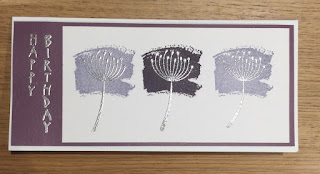
A Study in Purple

Long and thin, no, I'm not talking about me, unfortunately, just my card for this week's challenge at CAS Colours & Sketches where we have a new colour challenge, chosen by Stef


This looks like an awesome combination, just up my street, as they say, me being a purple and silver fan. However, I have to admit that I don't get on withElegant Eggplant. On the case of the ink pad it's a gorgeous deep purple, but when I stamp it it always looks black. So, stamp it off, I hear you say! Then it looks grey.
I am hoping SU will bring out a better purple soon, but enough moaning, where's the card???


I used Work Of Art to create the three colour blocks and then had to wait before I could stamp the seed head in Versamark to heat emboss in silver.


The vertical greeting was in the freebie magazine set I used to make my oriental themed card a couple of weeks ago. It's the only one I have, although I always look out for more. I used elegant eggplant card stock for the mat.


Thursday, 21 January 2016

Cake Anyone?

The colours in today's challenge at CAS Colours and Sketches just said "cake" to me. I LOVE cake, and I love making cards with cake too.


Imagine my excitement when I saw the cue word at Addicted to CAS .....


I used an old cupcake embossing folder, which I think I've never actually used before and the So Saffron card stock. I don't actually have Soft Suede ink or card so I have had to make a substitute here, which is allowable under our rules. 


The sentiment is half of an image from the stamp set Big Day, and the red card I made by swiping my Rose Red ink pad over some white card and leaving it to dry


So where is the other half of the sentiment? Why, inside the card, of course!


I'm also entering this card into the birthday challenge at SeizeThe Birthday As I like to play over there when I can, and the optional 'topping' this time is CAS...my favourite style!

Once I had the design idea actually making the card was quite quick, it did take a few experiments  with the colours as to what part of the card I would use. I think it would look good with the brown card stock for the cake and the white for the cup cake case too. I did try to use the Rose Red for the strawberries but couldn't quite get it right. I'd be interested to hear any suggestions of how to do this.

Thursday, 7 January 2016

Happy New Year Take 2


I have taken a few weeks break from crafting to celebrate first Christmas and then the New Year with family and friends, back to work this week and so I just managed to squeeze in some crafting at the weekend. It always takes a while to get back into the swing of things, I find, but I knew what I wanted to craft and this card is already winging its way to its recipient...hope she likes it! It's for the first challenge of 2016 at CAS Colours and Sketches

I found a template for this fold in my crafting stash, which got a good clear out over the holiday. It is made from one sheet of A4, folded into quarters, then two of the edges are folded over again and a cut made half way up the centre fold. The card cleverly folds over to create the three layers in the corner, hope you can see what I mean in the bottom photograph.

I used my Pennant punch and some coordinating papers to make a banner, to which I have stuck some 3D numbers. I layered up the large Nd small pennants from the punch to add depth to my bunting and used grey and white twine to make the string.


In one corner I have added more DP and I finished the card with a row of "hello" stamped in the three challenge colours


I hope I can remember how to make this card again, it's such a clever fold which can still stay true to the idea of clean and simple. 

Thursday, 3 December 2015

sentiment takes centre stage

December! Nearly Christmas! So, at CAS Colours & Sketches we are getting ready for the season with a special Pick A Previous colour and make it Christmas challenge.
It's very easy to do as there is a colour challenge archive on the blog, just browse through 2015 colour challenges and pick your favourite one and give it a Christmas makeover. I chose challenge #144: navy, sky blue and metallic gold.


I used a technique I found on the Internet to create a sentiment-background stamp. I used a lot of different stamps and arranged them on an acrylic block in the design I wanted before inking them all up and stamping onto some white card. I used the dark blue colour for this. 


I have added the metallic gold by using a gel pen and then layering up on gold mirri card.  The washi tape looks lighter than this is day light, it is probably a shade darker than sky blue, but  I hope it will do. It looks a bit like a present, doesn't it? Apologies for the shadow on the photo, it was taken late last night.


Thursday, 19 November 2015

Icicles from Grunge

I'm still hosting at CAS Colours & Sketches and today I've chosen a colour combo which I have used for some contemporary Christmas cards. I've got two variations to show you, both are CAS of course but first let me show you the colours

I saw a card that used this stamp from Gorgeous Grunge and it reminded me of icicles, especially stamped and embossed in metallic silver. I added a peel off sentiment and used cardstock to add the colours


This is a tent fold card and you can see a sprinkling of silver stars.


Whilst I like card number 1 in real life, it looks a little 'heavy' in the photo so I had a go at the same design but stamped on white card, just adding the colours in the mats. This time the sentiment is stamped and its from Holiday Home


Instead of the peel off stars this card has a few strategically placed silver rhinestones to add the Christmas twinkle.


Thursday, 24 September 2015

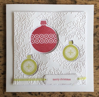
Christmas Keepsake

Thursday's sure come round quickly! It's time for me to share a card made for today's challenge at CAS Colours & Sketches. It is a sketch challenge this week. I also had a little help from the colour challenge at Cupcake Inspirations and from the cue word at casology. I haven't made a Christmas card in a while either. Some of you will remember that I used to design for 52 Christmas Card Throwdown and I hope my old teamies over there won't mind me playing along this week with their challenge too.

So here it is, or rather they are. I made two cards, in truth because I messed up one and had to make the second but the first one was still good and well, you can't have too many handmade Christmas cards can you?


This one is for CC&S. I used Ornament Keepsakes, a retired stamp set from SU, but still a good one and an embossing folder with a holly leaf pattern. The sentiment is from Holiday Home and I used a die tag to cut it out. The images were stamped, die cut and recessed behind the embossed card. This is my card for Cupcake Insirations too.


Here is my second card for the other challenges. I've used the same sketch but not used the embossed layer. I changed the tag and used tape to affix the ribbon to look like the strings from the ornaments. With its lack of embellishments I think this would be a great Christmas card for a guy and that's the challenge at 52CCT.


You can see that the ornaments were popped up this time. The Casology cue is circles, and I want to thanks those ladies over there because that's what made me go rummaging through my stamp sets to find this one again!


Oh, nearly forgot, here is the sketch and the colour palette


Thursday, 17 September 2015

Spooky As A Tree

Happy Thursday to you all! On Thursdays I post my DT card for the newchallenge at CaS Colours &Sketches and today I have a colour challenge card for you.

This time I used the colours to create a small scene which, centred on a white card blank. Lovely As A Tree was sat on my table, I just LOVE this stamp. It was my first SU set and it's timeless, versatile and stamps perfectly every time.


This time I've created a background by swiping the ink pads over white card stock. This gives a great effect, different every time you do it, and the new juicy ink pads work so well. I cut the part of the image I wanted to use and then added the bats.The dark stamping of the trees, bats and sentiment has all been in Chocolate Chip. To keep it CAS I did not use a colour mat, just adhered the scene to the card blank. The tiny sentiment also allows lots of white space.


Can you spot the Wild Wasabi? Probably not, as I used Certain Celery, but any light green will be fine for the challenge, and mine is hidden by an over swiping of the Lost Lagoon. This allows the foreground to appear different from the sky. Take a closer look..


I promise you it is there, but it was too light on its own for a night scene. the little bats and the greeting are from Holiday Home. I really like it when you can take an essentially non-CAS technique and make it clean and simple by your design. This is probably only the third Halloween card I've made,like ever, but it is my favourite, I probably overstating it but  it feels like art!

Thursday, 20 August 2015

Autumnal Thanks

Still on holiday so here is my scheduled post for this week's challenge at CAS Colours & Sketches it is a colour week


Now, I don't have Cajun Craze, so I went with a generic orangey- brown colour. Mine is probably a little lighter than CC but it still works in the colour palette. Whilst CC&S uses Stampin Up names for colours it's more than OK to use any other brand, as long as the colours are close.


I stamped the ink pad onto white card and left it to dry before over stamping with Marina Mist. I also stamped the Thanks ( from Seasonally Scattered) on the card base in the same Marina Mist and then matched up the two images. Before sticking down the panel I stamped some leaves from Kinda Eclectic


Finally I added a double score line frame around the edge of the card, keeping it CAS with minimal layering. Sorry about the title, I'm not wishing the summer away, it's just that my card seems to be rather autumnal in design.The whole card is based on stamping and I was after a thank you card suitable to send to a man. These colours definitely said 'man card' to me but I will look forward to seeing what others create from them.


Thursday, 23 July 2015

Faux Pinwheel card

Look out for the new challenge this morning at CAS Colours& Sketches. It's a sketch and it's a really great one, where there are so many different ways of using it.

I had all sorts of stamp sets out on my table for this one, but in the end I saw something on the internet that I wanted to try. It's called a faux pinwheel.


The other change I made is that I decided not to go with the square cards I usually do but to go tall and thin. I moved the panel up to the top of the card, as you can see.


  The sentiment is from Sweet Cake, one of the sets I was originally going to use, stamped in Daffodil Yellow


The card panels I used for the faux pinwheel, the closest match for Coastal Cabana, I embossed, using a Patchwork embossing folder. By carefully positioning the squares of card on the folder I could get a different effect on each square with just one pass through the Big Shot. The red, coral  and yellow DPs are all from my Stampin' Up stash, as is the giant brad. The pinwheel does actually turn as I only attached it using the brad.
If you are wondering about the colours, I had a little help from
The ColourQ Challenge with these gorgeous summery shades