Thursday, 10 December 2015

It's Snowing!

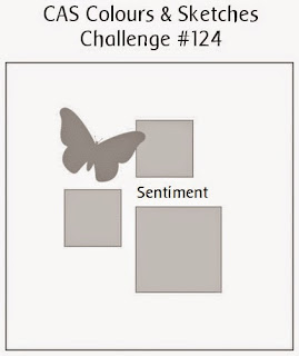
OK so we are here in December, the countdown to Christmas has begun and to keep you in the festive mood we have a Christmas challenge for you at CAS Colours & Sketches. We are looking for cards using a previous sketch challenge but made for Chritmas this time. I have gone with a sketch which I just loved but didn't design for as I was away on holiday. Remember this one?


We were doing an evening of white embossing on coloured card at my craft club back in October and this one came together there. The sentiment is a magazine freebie and the card is from a set called jewels. I used black card to make the card blank, adding a liner so that I can write inside when I come to use it


The snow is a piece of acetate, layered on top of the base and the snowflake is a peel off


These two pictures show the dimension I achieved using foam pads. The sticking down of the acetate is cleverly concealed by these panels!


My stash of cards for Christmas is growing slowly. Soon it will be time to write and send them all and then I can start all over again in January! When do you start with your cards?
Wednesday, 9 December 2015

Christmas in The Male Room

What makes a good Christmas card for a man? That's the challenge for December at
The Male Room

When my acryllic block was out on the table I decided to make another sentiment card, this time using stamps from Stampin Up and heat embossing the sentiment images. Using a black and silver colour combo also adds to the masculine feel of this card. 


I used some glitter card to add some subtle glitz and made my card base out of silver pearlescent card, folded into a tent fold


If your stamping works first time (as mine did, surprisingly, can't say the say for the card in my previous post) it's a quick and easy make and, with the stamps mounted on the block easy to make a few of these to send out.


Thursday, 3 December 2015

sentiment takes centre stage

December! Nearly Christmas! So, at CAS Colours & Sketches we are getting ready for the season with a special Pick A Previous colour and make it Christmas challenge.
It's very easy to do as there is a colour challenge archive on the blog, just browse through 2015 colour challenges and pick your favourite one and give it a Christmas makeover. I chose challenge #144: navy, sky blue and metallic gold.


I used a technique I found on the Internet to create a sentiment-background stamp. I used a lot of different stamps and arranged them on an acrylic block in the design I wanted before inking them all up and stamping onto some white card. I used the dark blue colour for this. 


I have added the metallic gold by using a gel pen and then layering up on gold mirri card.  The washi tape looks lighter than this is day light, it is probably a shade darker than sky blue, but  I hope it will do. It looks a bit like a present, doesn't it? Apologies for the shadow on the photo, it was taken late last night.


Thursday, 26 November 2015

Trying Too Hard?

Just got to n very late from a trip to Liverpool to visit my son and remembered on the long drive home that I had forgotten to write my post for CAS Colours & Sketches, as I'm the hostess this week that is a bit of a big deal, so it's 11 pm and I'm writing it now!
For the fourth Thursday in November ( and a very Happy Thanksgiving to all of you celebrating in the US) it is a sketch and when I came up with this one I was rather pleased with myself. Yesterday when I was trying to make my card I was less pleased, it was so hard! So, if you give it a go you will certainly get a complimentary comment from me! Here is the offending sketch ( no one else to blame for it, just me)

When I sat down to craft my card I thought about cutting two circles of DP, but it just wasn't enough for m. I saw that a couple of my  teamies had already created cards like that ( and they are fab too) but I thought I needed to show a different way. 


I remembered making 3D baubles one Christmas and wondered if it would work with half circles. Well, what do you think?


I used a Kraft card blank, some pearlised gold card and then some Kraft and white/ red papers to make the baubles


I used washi tape for the greeting and the only stamping on my card are the two little bows, carefully positioned and stamped in Stayzon to ensure they didn't smudge on the pearlised card


Wednesday, 25 November 2015

Thanks, Man!

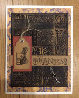
i have a vintage style thank you card this morning to share. As its for The Male Room Challenge it is, of course, designed for a man with more than a little help from the sketch over at The Paper Players.


This card started life as a technique workshop, where we used dark card stock, embossed and rubbed over with a metallic ink pad, to resemble metal work. Here it is black card and a copper coloured ink on a printing press themed embossing folder ( no idea which brand as I borrowed it on the evening)


I have used this as a top layer, and put some vintage K&Co paper behind it. The banner is stamped with a sentiment from Vintage Verses- I used Chocolate Chip on Kraft card.


I have made a small mat from some DP, from Adventure Bound- these are brilliant papers for masculine cards, and added a small Kraft tag with a stamped vintage car image. I sponged all the edges of the layers with Crumb Cake


The finishing touch is a little clock hand added to point to the sentiment and I've used a small Brad to attach it.

Thursday, 19 November 2015

Icicles from Grunge

I'm still hosting at CAS Colours & Sketches and today I've chosen a colour combo which I have used for some contemporary Christmas cards. I've got two variations to show you, both are CAS of course but first let me show you the colours

I saw a card that used this stamp from Gorgeous Grunge and it reminded me of icicles, especially stamped and embossed in metallic silver. I added a peel off sentiment and used cardstock to add the colours


This is a tent fold card and you can see a sprinkling of silver stars.


Whilst I like card number 1 in real life, it looks a little 'heavy' in the photo so I had a go at the same design but stamped on white card, just adding the colours in the mats. This time the sentiment is stamped and its from Holiday Home


Instead of the peel off stars this card has a few strategically placed silver rhinestones to add the Christmas twinkle.


Thursday, 12 November 2015

Spotlight on Dasher

It's my second week hosting at CAS Colours & Sketches and it's the turn of the sketch. Now I don't mind telling you that this sketch has caused a few problems for me, not least because over at the challenge blog we are celebrating 150 posts! Yes, 150... We are nearly three years old, and so it had to be a good one as there are prizes up for grabs! Enough, you say, show us the sketch


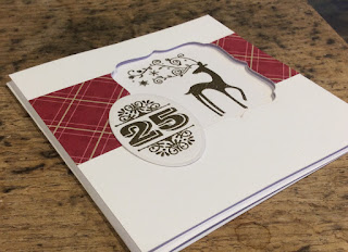
I think the fact that I've added an aperture, rather than a shape, may push the challenge. Also, you must use a 1 5 and/or a 0 to qualify for the prize draw. I decided to go all Christmas on you again


Recognise him? Yes, it's Dasher again. Stamped and heat embossed in gold, set into the aperture
Teamed up with a number stamp from Merry and Type and some SU DP.


You can see the aperture more clearly on the following shots. Very clean, very simple, quick and easy once I had decided on the theme.


The gold and the plaid go together so well for Christmas don't you think?


You can see I have used 25, which has a five in it, so it's good for the draw, you don't have to use just the 1 5 or 0, as long as we can see one of them there. Hope you find time to join in this week.

Wednesday, 11 November 2015

Cards for Sad Thoughts

Good Morning! In November, once the foreworks and bonfires are over in the UK we usually turn our thoughts to Remembrance Day, the 11th day of the 11th month. I rather lik the fact that the whole of the country stops at the 11th hour for a two minute silence, even in the busy high school where I work. My husband  and sons also attend the Rembrance service in church on Rembrance Sunday, as members of the local counting group. All that said, I went with a sympathy card for the new challenge at The Male Room.


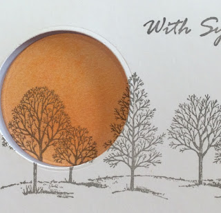
I love Lovely As A Tree, it's so versatile...here it makes a muted sympathy card. First job was to cut the aperture. After stamping the image in grey, directly on the front of a card blank, I inked up another piece of white card with a selection of sunset colours, just blending and mixing pale pink, oranges and yellows. I cut a similar sized circle from this inked up card.


Using the stamp positioning tool, I lined up the circle underneath the acetate sheet in the correct position and stamped the tree image on top.


Then it was just a matter of popping the circle into place, which I did, through the cut aperture.


 I added a scored border and a generic With Sympathy sentiment. On the photograph below you can see how well the stamped images match up.


After a tip off from fellow DT member,Rocky, I will be entering this card in the challenge at House Of Cards, a new to me challenge blog where the theme for November is a stamped and cut window technique.

Sad, but uplifting was the idea behind this card. I have already had to use it, as a friend of mine lost their Mother in between me making this card and writing the post, it's always useful for me to have one or two of these cards ready to go as I rarely feel like crafting when I get sad news like this.

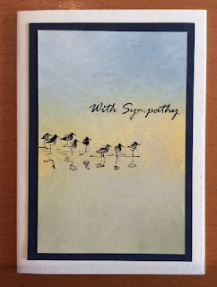
I made two, the second card using Wetlands and one of those glossy inked up and cling filmed backgrounds


The stamping of the sentiment was not really good enough to use this one as the DT ample but I'll keep it in my stash.


Thursday, 5 November 2015

Blackberries, Mustard and Chocolate!

All through November it is my turn to host the challenges at CAS Colours & Sketches. I've been on this team since its inception, nearly three years ago! Clean and simple is definitely the style I have grown into, I do try others some times but my CAS cards are always my favourites. This week I chose some warm, spicy colours for everyone to play with


I had so many ideas for this one but it was at my monthly craft club meeting that this card finally took shape, as we experimented with heat embossing onto dark cardstock. One of the crafters there had made a square card with four panels of a repeated sentiment. I have adapted her design, with three panels on a rectangular card base. It's hard to see the Blackberry Bliss well on these shots, but in real life it looks gorgeously rich and dark.


I used the boldest sentiment I have, from the Happiest Birthday Wishes set- I really could do with buying some more sentimental  sets. Any recommendations?


I didn't have the mustard colour card, so instead I used the ink pad to colour up a piece of white card. It worked just fine after I had left it to dry for a while


The base is made from SU naturals white card, it matched the Vanilla colour of my embossing powder better than white. Lots of dimension here, with the sentiment panels popped up on foam lads, along with the naturals white mat. I think my card has come out quite masculine, not on purpose, but I'm fine with that...lots of men in my family will be needing a card soon.
Hope you get chance to have a go with these colours, can't wait to see your creations.

Thursday, 29 October 2015

Petal Power

It's the double challenge at CAS Colours & Sketches today and I have a birthday card to share with you. For this challenge you must use the sketch AND the colours given. I must say I do like this combination.

I rotated the sketch, which is allowed, of course, and moved the sentiment over, but I think you can still see the basic sketch in my card. I used a stamp set that I haven't used in forever! It's called Paisley Petals, and I've probably only used it a couple of times before.


I stamped the large bloom image three times onto Wisteria Wonder card (it looks a little pink here, but it definitely is pale purple) using the Rose Red ink and fussy cut them out.


 You can see one of the flowers is popped up on foam pads to add a little dimension to my card. The bold sentiment is one of my favourites from the set Happiest Birthday Wishes.


The card used for the layer is Razzleberry ( actually the closest match I have, it's OK to use ink or card which is not Stampin Up, we just use the names for reference, as long as it's close)
 I'm scheduling this post as today we are heading off to London for a couple of days to see a show and visit some museums, and mooch around. A late birthday celebration.

Wednesday, 28 October 2015

Incey Wincey Spider

I'm going to squeeze in one more Halloween card this October, well I still have a couple of days to send it out. This one is for the new stash challenge at The Male Room, a challenge blog for masculine projects. Here is the theme

....so for my card I used a brad. Yes, I know, a brad, just one.


Here it is, a little spider, sitting in a stencilled web, with his little legs hand drawn on and a small sentiment, from Holiday home. Want a closer look?


So, if you're not keen on spiders ( and I have to say I quite like them, and certainly I'm not scared of them in any size) don't take a peek inside!


I added a hand drawn thread to this guy. I hope that the fun side of the card would appeal to the male sense of humour. Not sure if everyone knows the Incy Wincey spider rhyme I used for the title of this post. Something I remember from my children's and, in fact, my own childhood. 

Incey Wincey spider, climbed up the spout, 
Down came the rain and washed poor Incy out.
Out came the sunshine and dried up all the rain,
So Incey Wincey Spider climbed up the spout again.