Thursday, 28 April 2016

one layer Congratulations

It's my last week as hostess at CAS Colours & Sketches and it's the turn of the sketch. I really wanted to try and find something which I had not seen before and came up with this one...
I have also really kept it very CaS by opting to go for a one layer card. These can be very frightening, especially to a messy crafter like myself . 


I used Happy Celebrations stamp set and six different coloured inks to stamp my lantern chains.


The sentiment is from Sassy Salutations 


Spot the difference in the last photo. It is the card which nearly didn't make it due to a splodge, but I managed to save it, if not as a DT piece at least as a card to send to a friend or colleague...I hate waste!


Wednesday, 27 April 2016

A Horse, A Horse....

New challenge at The Male Room this morning and I was quite excited about this one...so much to choose from. You will know, unless you have been hiding in a cave, that it was the 400 year anniversary of Shakespeare's death last weekend. Love his work or not he is still a huge influence in our lives if you are an English speaker as so many of his phrases are in daily use. I wasn't a fan until I started to see his plays, mostly in The Globe in London, a recreated Shakespearian theatre which is an absolute must-see if you are there. Now I try to go as often as possible. They are equally good in his home town of Stratford, which is much closer for me.
So, what to do? I went for a well known line from Richard III, "A horse! A horse! My kingdom for a horse!"  But, if you look carefully you might see "Out, damned spot! Out, I say!" From McBeth!


I wanted a good background for my galloping horses, and went for brayering. I am still very much an amateur at this technique but I watched a great YouTube clip which helped, the link is 
here 

After brayering the sand and sea/sky using Indigo Ink, Baja Breeze and Hello Honey and Crushed Curry I stamped the horse image in Early Expresso multiple times? The hardest decision was where to place the sentiment. Using a Stamp-A-Ma-Jig meant that I could look at it in several positions, I finally settled on the mid-page. 

My card is tent-fold and is quite big, A5 size. It will be for my Dad. To finish off I used a black mat and foam pads to give the image a lift off the front of the card, it was in danger of being just a little too flat.
I hope you enjoy the Shakespear theme, there really is so much you can do with it!


Thursday, 21 April 2016

Card Evolution

I knew the colours and the theme for this morning's card weeks ago....well, I did make the challenge myself as I continue to host CAS Colours & Sketches for April, but even so it is Wednesday evening and my card is only just finished.


This is the one, the final version, a one layer card using Work of Art and a magazine freebie image.


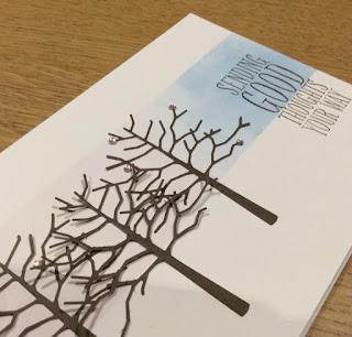
This was my original card and design. I wanted a bokeh effect on the pink and blue and die cut the cherry trees. It's not that I don't like it, it's just that it didn't quite come out as I'd hoped. I added a few tiny pale pink rhinestones, they improved it but didn't really feel as CAS as I wanted.


Two more attempts at the masked panel of blended inks and !%*#^ bokeh and I gave up.


I wanted something arty so I turned to my favourite way of colouring, Work Of Art stamps. I loved this card until the final stamp, also a freebie. It just wasn't crisp enough for my liking, not for a DT card....


So here it is again, the final card. Hope you enjoyed the short story of its creation and manage to get your card for the challenge made with a little less frustration.


Thursday, 14 April 2016

Kinda Eclectic Thank You

So, I'm hosting over at CAS Colours &Sketches and had to design a sketch. I don't know how you do this, but I tend to think of a card and 'distil' the design from that idea. This time I really wanted to have a change in size between the two elements on the card.


I used three stamp sets, as the butterfly from my Kinda Eclectic set has gone missing. I did quite a lot of 'precision' stamping, using my Stamp-a-Ma-Jig to get things in the right position (still had quite a few goes to get things right!)


First I stamped the large sun image in Crushed Curry. Then I split the sentiment stamp up and stamped off first in one direction and then the other to get the faded effect. I really wanted the words to line up centrally.


Finally I stamped and fussy cut out the butterfly from Papillon Potpourri before colouring it with watercolour pencils. I've used Perfect Plum ink for the sentiment and matched the colour for the butterfly.


Finally I used some foam tape to pop up the card front. I do hope that you like the sketch and will give it a try. Do go and have a look at the super examples my teamies have made with this sketch.

Wednesday, 13 April 2016

Triple stamped Wetlands

Today's new challenge at The Male Room Is a fun technique challenge, Triple  Stamping. This was one of the first techniques which I was shown when I first got into stamping and I still love it: it never fails to please.

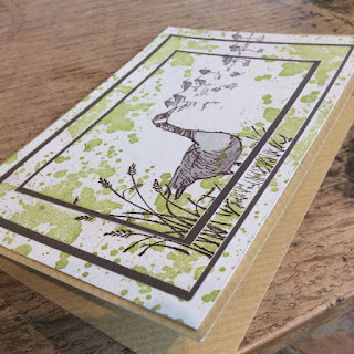
I've combined two stamp sets, Gorgeous Grunge and Wetlands and I've kept to a fairly restricted colour palette with Lucky Limeade and Chocolate Chip, with some basic grey colouring on the adult goose.


The technique adds to the effect of the perspective, with the goose stamped on the uppermost card layer and the bird silhouettes stamped across the three layers.


I used a Kraft card base and have stamped the birthday greeting and another goose on the inside (should have photographed that as well I suppose). The stamping is done all in one go, after cutting the panels and placing them on top of each other. I have used narrow borders to separate the layers. 


The fun part is seeing them all line up. The edges which do not stamp clearly are somehow lost to give the finished card a clear image.
These cards work well for men as they are 'different' without being too fussy.


Thursday, 7 April 2016

Tangerine, Melon and Daffodils

It is my turn to host the challenges at CAS Colours & Sketches and I enjoyed choosing colours and designing sketches with Spring in mind. My first week was inspired by the flowers in the garden, lots of yellows and oranges, with the daffodils, and pinks from the primulas and tulips, the hardest part was only being able to choose 3!


When it came to making my card no green was a challenge, but in order to be chosen for top picks only the three colours maybe used.

I used the acetate block print technique to add the colours and then stamped the image, from Simply Sketched,  in the matching ink


It needed a long, narrow card base for this design to look its best. I added the birthday sentiment from the same stamp set and a Melon Mambo mat to add a pop of colour.


Love the arty look of this card, which still manages to hold onto a CAS style with the lack of 
 Embellishments and the use of white space.